Samsung
Samsung U.S Newsroom Redesign
Rebuilt the website to align with the Samsung master brand, enhancing user experience and increasing engagement with S.com.
My Role
Design lead - User Research, Product Strategy, Product Design, Design System, Prototyping
Tools
Figma, Photoshop, Illustrator
Team
Agency: Barbarian
Design Director, Tech-lead, Software developer, Project Manger, Account Director, Senior Analyst, Junior Designer, Copywriter,
About
Samsung US Newsroom site is a centralized communications hub that keeps the press, public, and partners informed about Samsung’s latest innovations and corporate activities in the U.S.
Client Goal
Modernize the design to align with the Samsung global brand and create a fresh, credible visual experience.
Simplified navigation & user journeys by decluttering the interface and guiding users through a clear, intuitive content journey.
Boost on-site engagement and click-through rates to Samsung.com by improving content structure and user flow.
Our Approach & Major UX update
1. Visual Alignment with the Master Brand
Typography / CTA / Color / Component Style
2. Optimize the browsing experiences and the choices.
Analyze the user behavior and simplify the user journey (to reduce the user’s cognitive overload)
3. Increase in-site engagement and click-throughs to S.com.
Optimizing the user flow and giving a clear visual differentiation between components and CTAs.
Results
1. Performance has improved YoY by optimizing a link strategy, updating our website, and using product module CTAs to direct traffic to S.com
New web design to enhance user experience
Analyze data and optimize link placement based on user scroll patterns
Balancing link placement and product module placement
Pageviews
+17.86% Yo Y
Outbound Clicks
+78.4% Yo Y
CTR
+97.8% Yo Y
2.Experience optimization has been a driving force of engagement.
Improving article layouts (linear flow, prioritized CTAs, enhanced product module), optimizing in-article linking strategy (internal hyperlinks vs. external hyperlinks), and enhancing the overall search-ability and discoverability of content across the newsroom.
CTR
11.56%
Pageviews
135,299
Pageviews
1,460,175
1.Let’s align with the Master Samsung brand.
We conducted a detailed audit of Samsung.com and applied consistent branding across the newsroom site:
01-A.Typography

Adopted Samsung’s official typefaces to ensure brand consistency.
01-B.CTA / Color

Aligned color schemes and call-to-action styles with S.com to create a cohesive look and feel across our digital platforms.
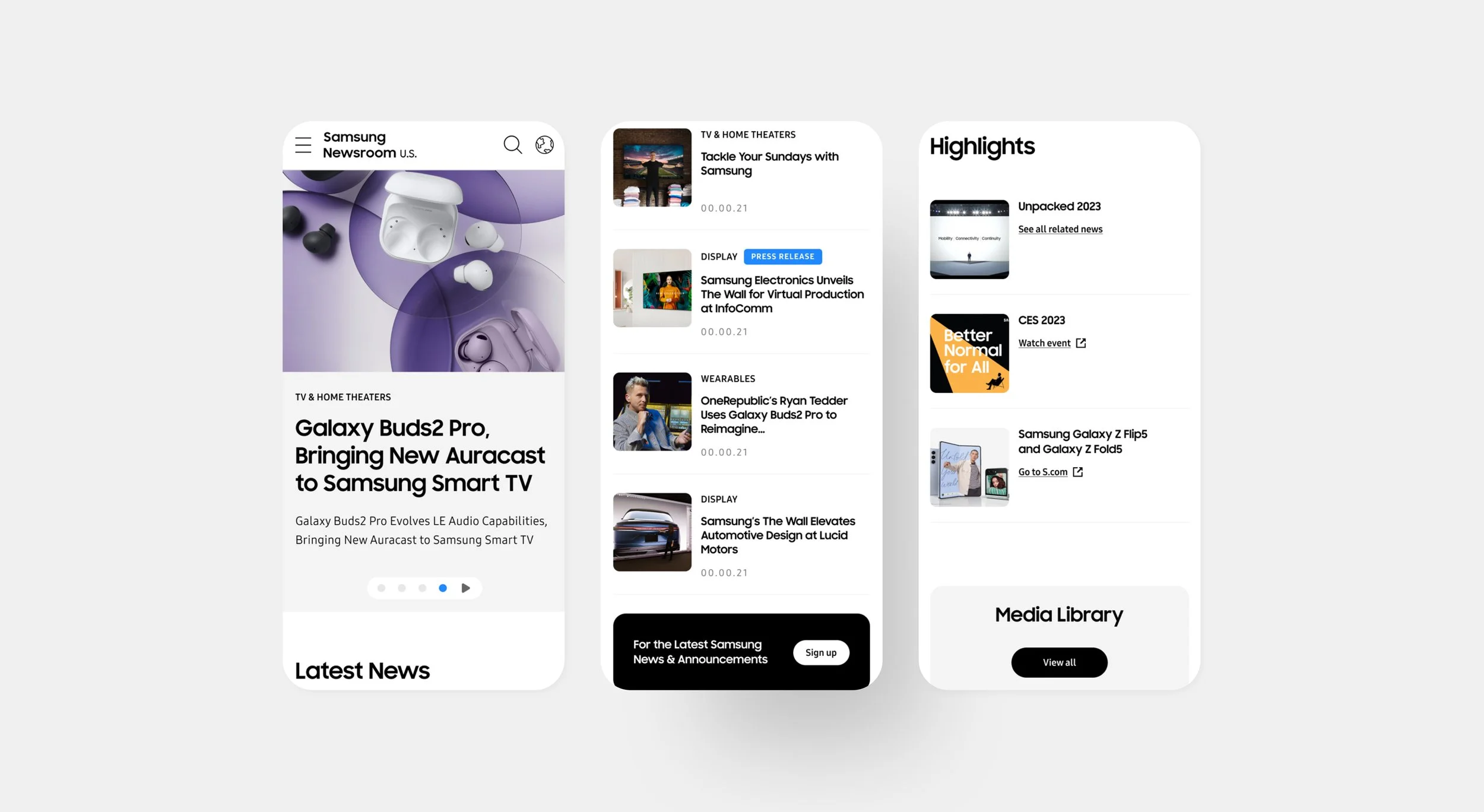
01-C.Component: Hero section, modules and the hover treatment
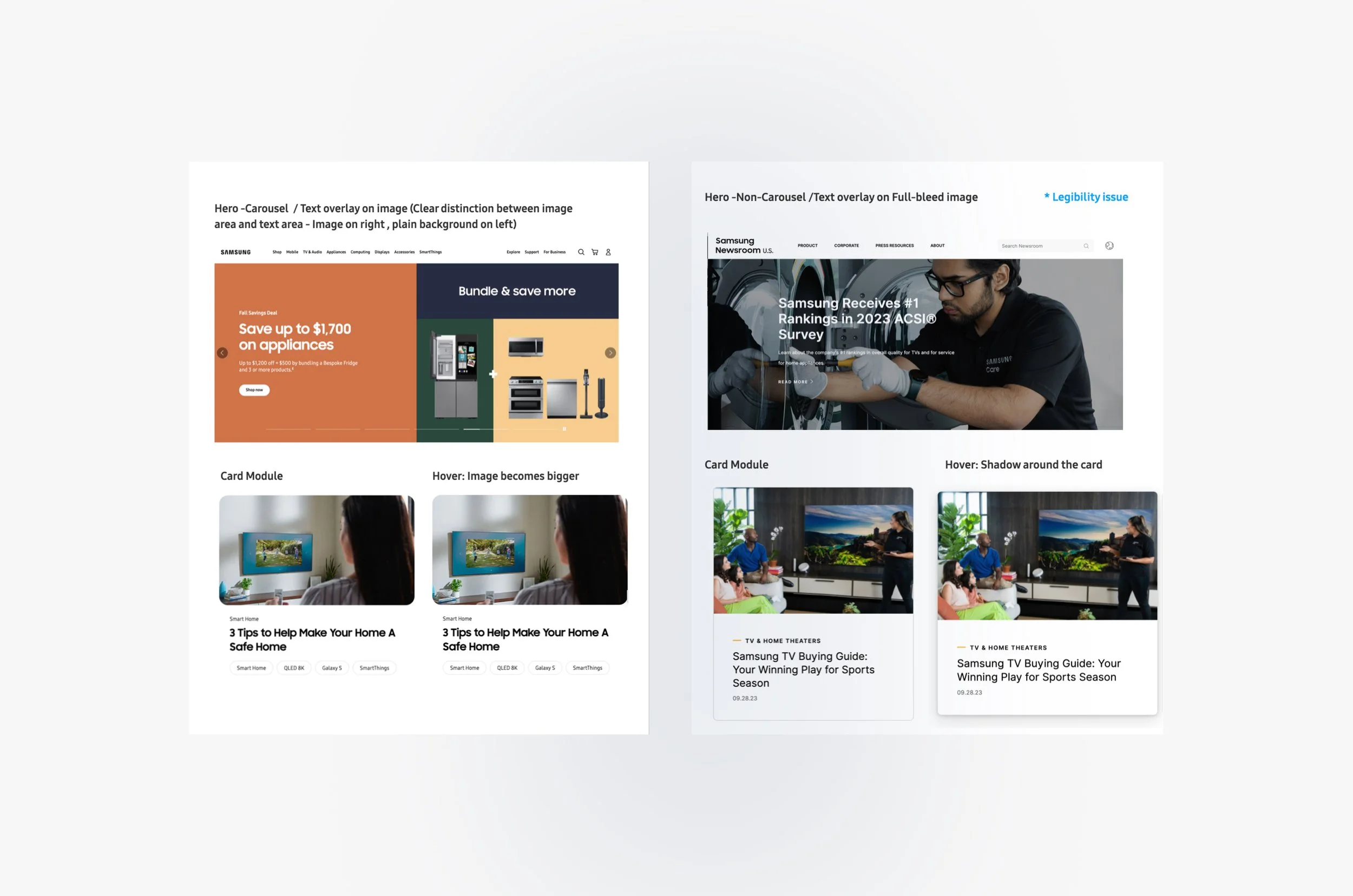
Rebuilt core components to reflect S.com’s design language, creating a unified cross-platform system.
02. Simplify the browsing experiences and choices.
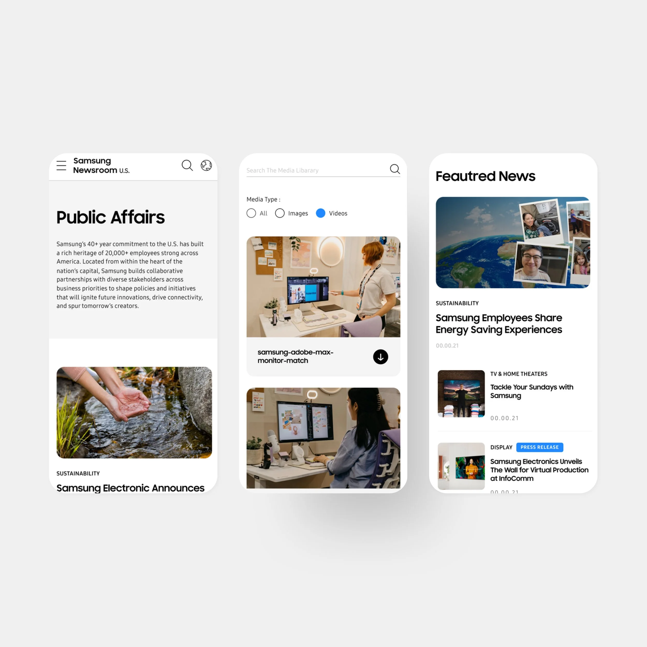
Newsroom users are mainly coming to the website to read articles and find updates. However, media library and events module give unfinished user journey, users may or may not have to click through more pages to end their journey. Also, these card components are not prominent enough to show that the destinations are all different. User could get lost during their browsing experience.
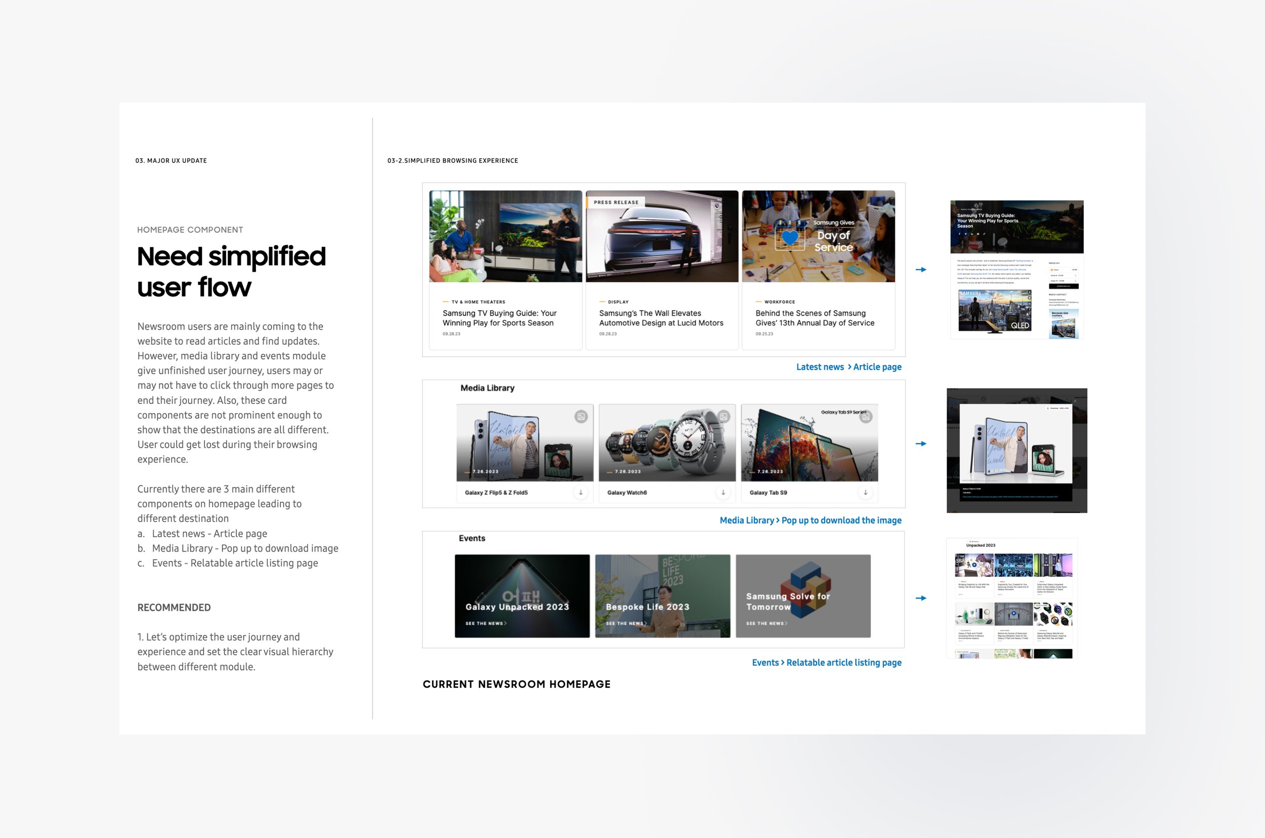
Currently there are 3 main different components on homepage leading to different destination
Latest news - Article page
Media Library - Pop up to download image
Events - Relatable article listing page
Recommended
Let’s optimize the user journey and experience and set the clear visual hierarchy between different module.
Original website wireframe
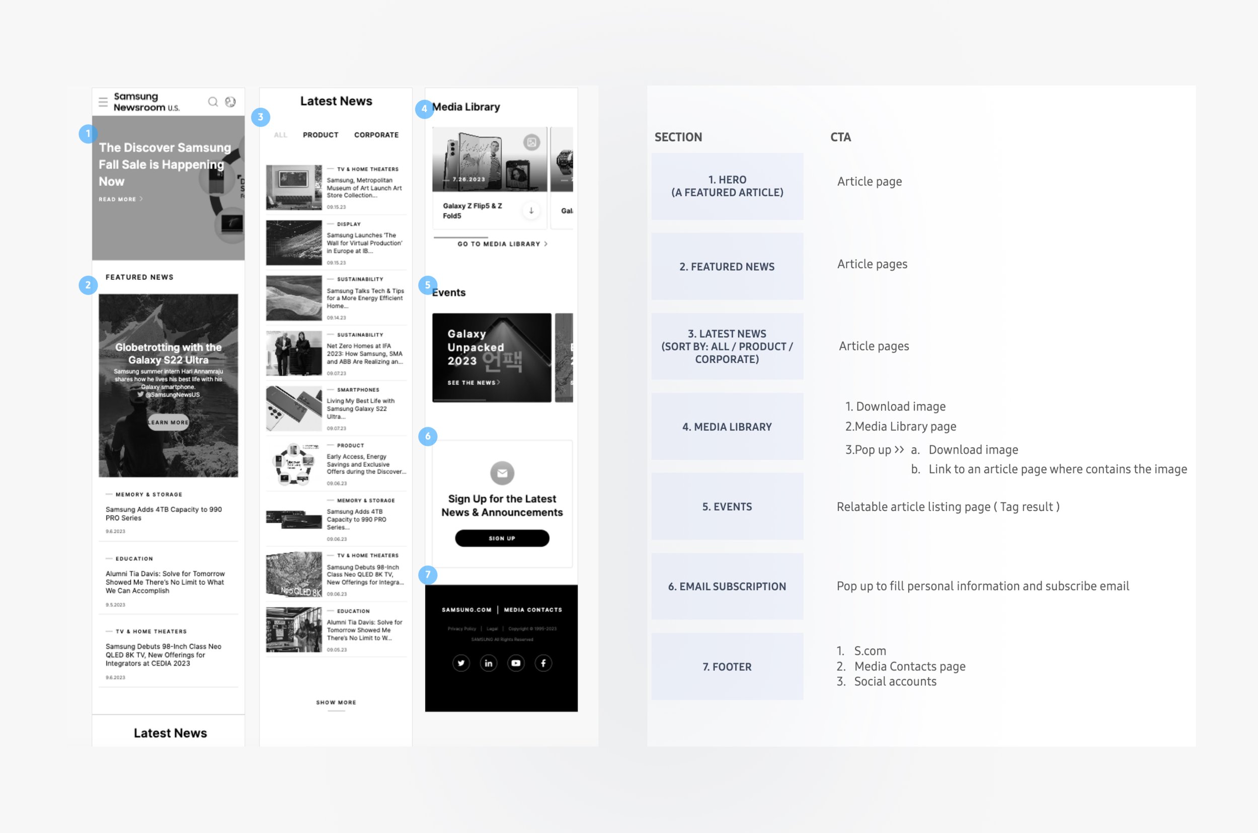
Original Issue
The homepage contained numerous similar-looking cards with unclear CTAs, causing cognitive overload and poor content discoverability.
Updated wireframe
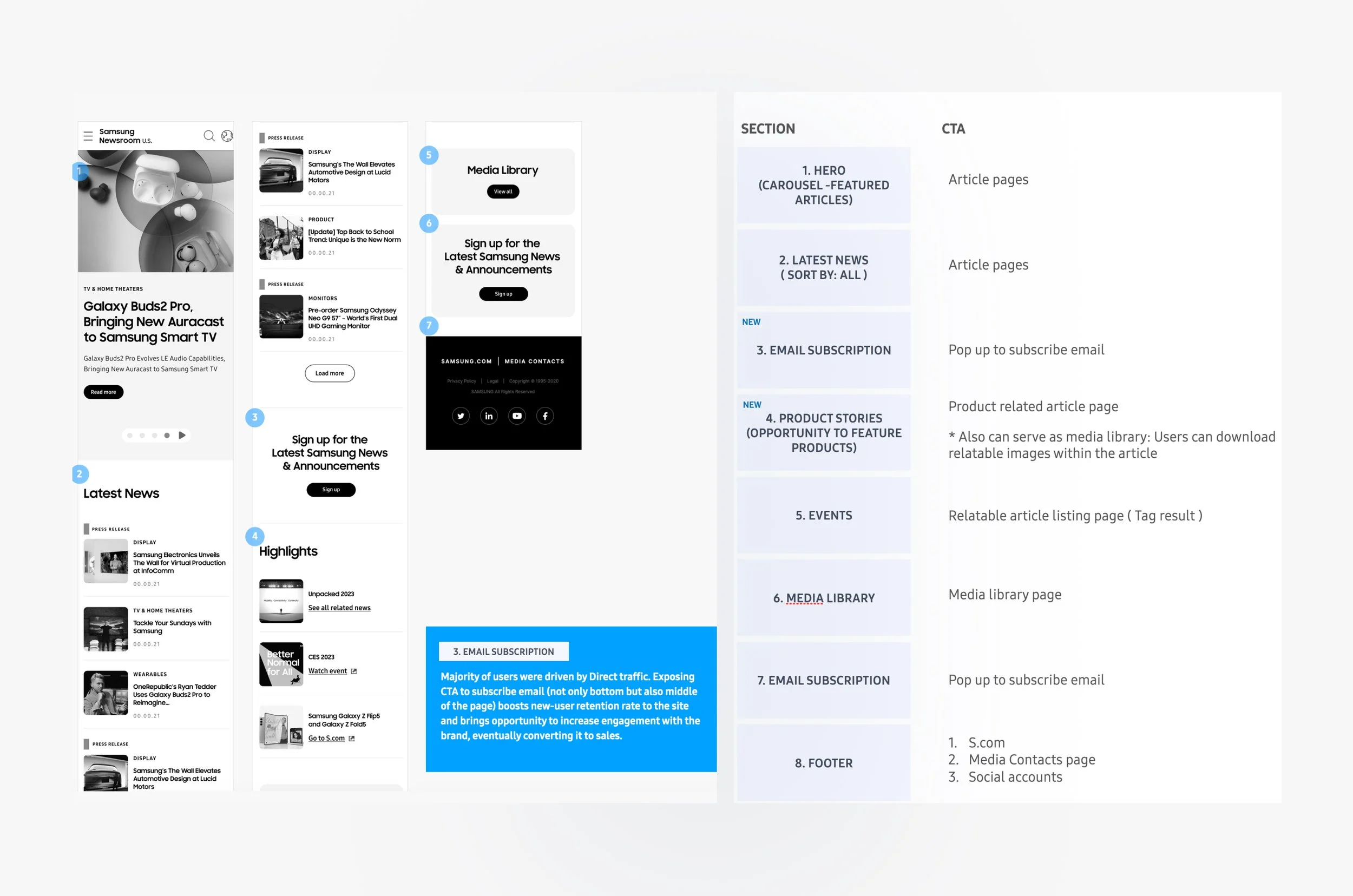
Solution
We redesigned the layout to establish a clear visual hierarchy and distinct CTAs:
Streamlined layouts to reduce distractions and enhance scannability.
Improved information architecture to guide users through content more intuitively.
03. Increase in-site engagement and click-through to S.com (conversion).
Let’s increase in-site engagement by optimizing the user flow and giving a clear visual differentiation between components.
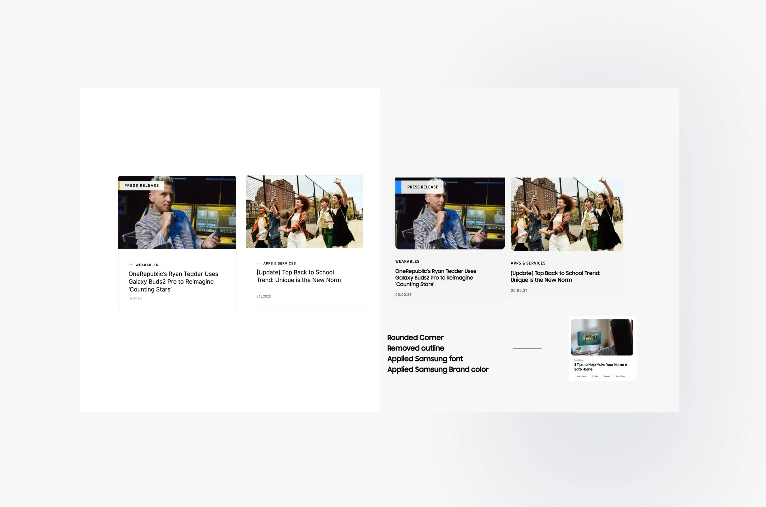
03-A. Clear CTA Differentiation to let user know their next journey

Ensured users could distinguish between article CTAs and external product links by updating styles like eyebrow text and buttons.
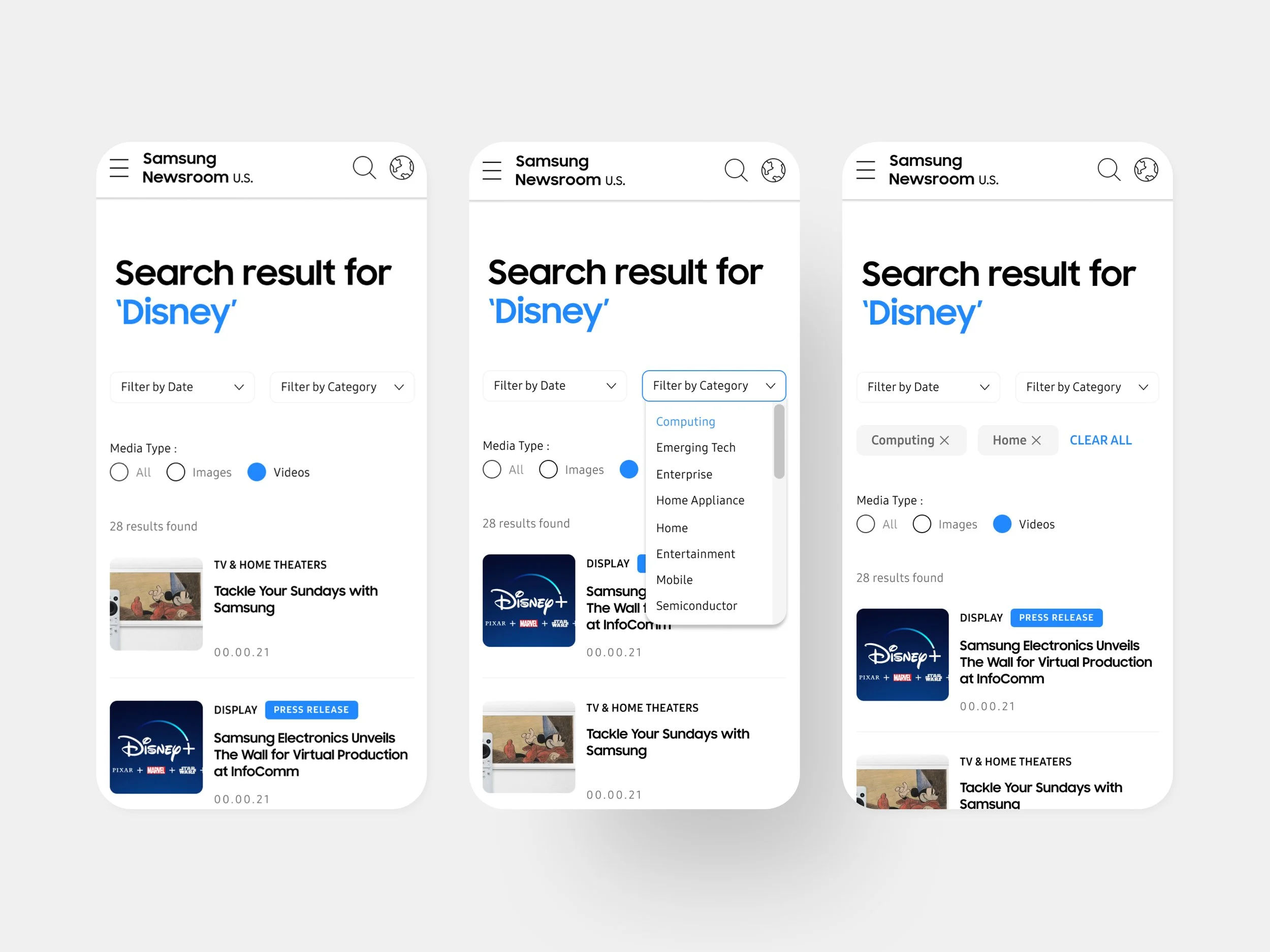
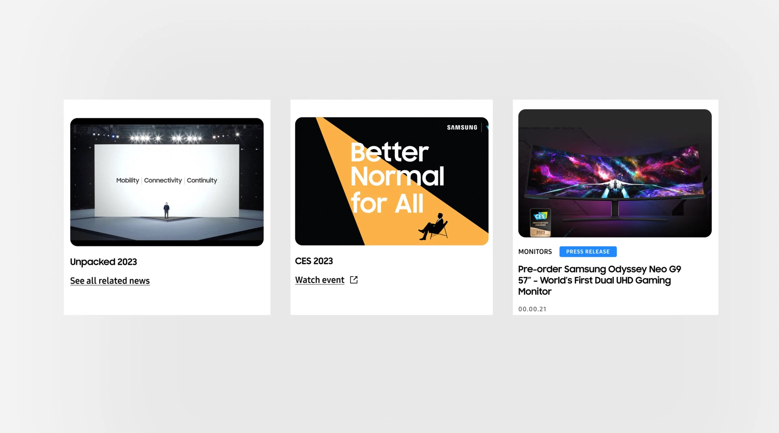
03-B. Search & Discoverability Enhancements
Upgraded the search page experience to improve content findability.
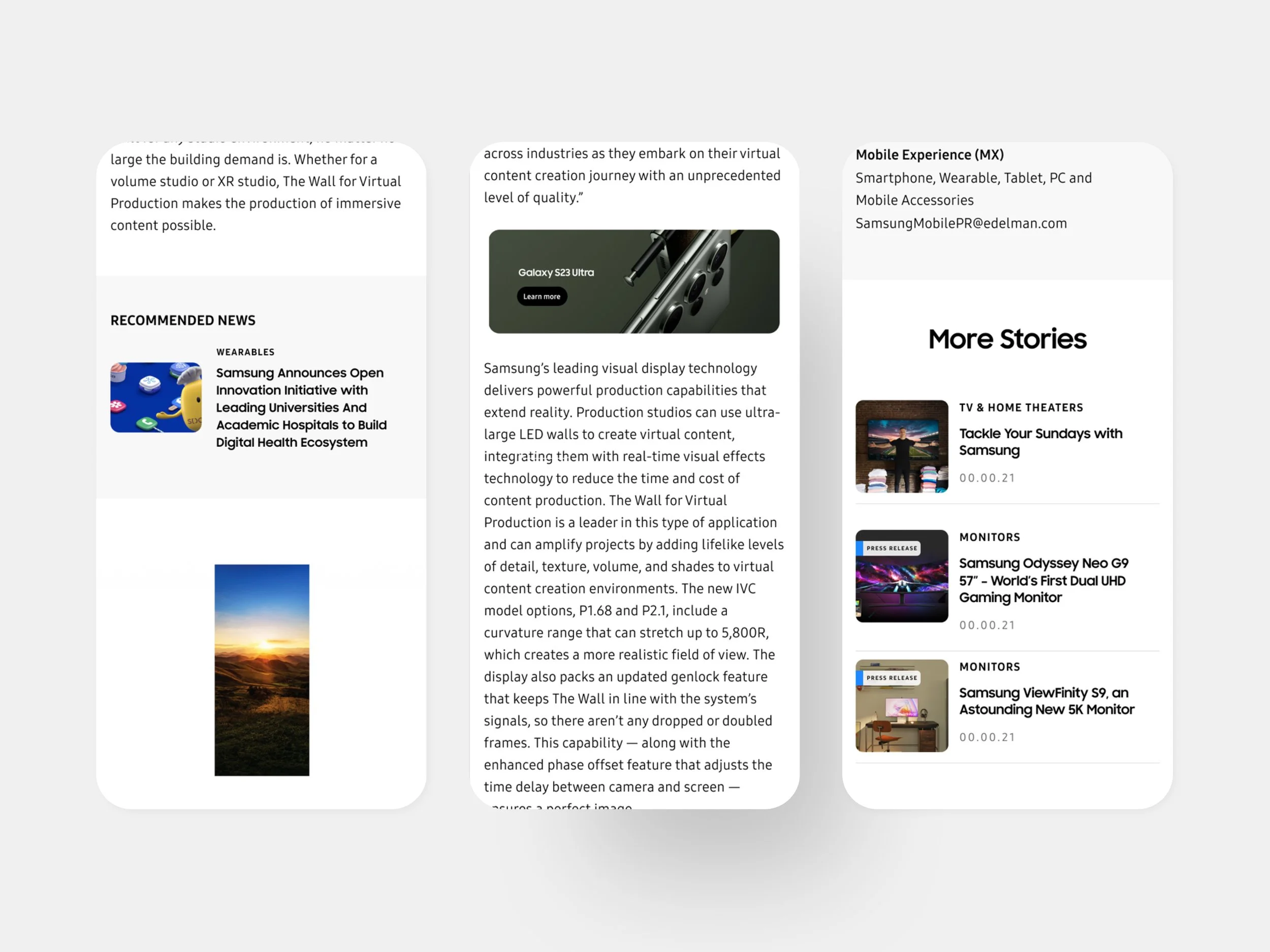
03-C.Smarter In-Article Linking
Removed homepage CTAs leading directly to Samsung.com to avoid interrupting the initial content experience.
Instead, we strategically embedded product banners and related articles within subpages and article bodies to promote contextual engagement and conversions.


Key Takaways
Aligning design systems across ecosystems isn’t just about visuals—it’s about enabling cohesive experiences that serve both storytelling and conversion goals.