Samsung
Wine Enthusiast
Streamline the website by simplifying the user journey, establishing a cohesive branding guide, and effectively merging e-commerce and editorial content into a unified, user-friendly website.
My Role
Product Designer (Data research, sitemap, user journey to design principle)
Tools
Figma, Photoshop, Illustrator, Hotjar, Google Analytics
Team
Agency: The Charles NYC
Design director, Senior designer Tech-lead, Software developer, Project Manger, Account manager, Executive producter
About
Wine Enthusiast is a long-established American lifestyle magazine dedicated to wine and wine culture, reaching millions of readers around the world. While the print publication reaches a wide audience, the website serves as a growing digital hub for editorial content and wine-related e-commerce
Client’s Request & Business Goal
The primary objective was to streamline the Wine Enthusiast website, which suffered from a complex sitemap and confusing user journey.
The site also lacked a clear branding guide and had the challenge of merging an e-commerce platform with editorial content on a single URL.
Our Approach & Major UX update
We began by analyzing the user journey and identifying pain points to ensure users could easily access both types of content and to enhance engagement.
We developed a cohesive branding guide to unify the site’s aesthetic and messaging, better supporting both e-commerce and editorial functions.
To tackle the complexity of merging editorial and e-commerce content, we optimized the layout and navigation—ultimately aiming to boost the conversion rate.
Result
By late 2023, traffic surged to around 4.5 million monthly pageviews, 2.5 million monthly sessions, and 1.9 million monthly users (per Google Analytics 4) making it the most‑visited wine media website
1. Began by analyzing the user journey and identifying pain points to ensure users could easily access both types of content

The site had a high bounce rate despite strong organic traffic, largely due to a disorganized user journey and numerous uncategorized custom pages. To solve this, we analyzed user behavior, defined target profiles, and prioritized content based on their goals. We also tackled the challenge of merging two separate sites—editorial and e-commerce—into one cohesive, easy-to-navigate experience.


2. Develop cohesive branding guide to unify the site’s aesthetic and messaging that better supported both e-commerce and editorial functions.
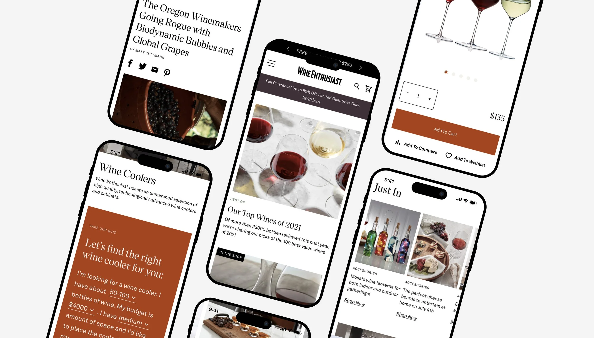
The entire experience was built responsively, ensuring seamless usability across desktop, tablet, and mobile. I provided developers with organized design files and documentation, including scalable components and interaction specs for a smooth handoff.

Design Highlights
Editorial Typography: Selected refined type styles to enhance readability and align with the brand’s tone.
Modular Layout System: Designed a flexible layout grid adaptable to various content types, maintaining a clean and elegant aesthetic.
CMS-Based Components: Created reusable modules that could easily be managed through a content management system.
Integrated Ad Placement Strategy: Considered fixed-size ad placements throughout the layout, similar to newspaper sites, ensuring advertising components could be effectively integrated without disrupting the user experience.

3. Optimized the layout and navigation—ultimately aiming to boost the conversion rate.
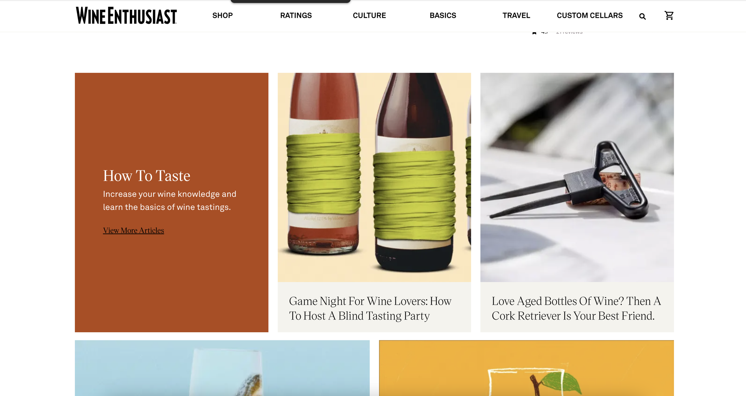
03-A. Sitemap
The Catalogue site faced several pain points, including numerous categories and uncategorized articles, which created a fragmented and difficult-to-navigate experience. Users coming for editorial content were also struggling to discover e-commerce offerings, resulting in a disjointed journey that impacted overall user engagement.

To address these issues, we restructured the site into a more cohesive platform, optimizing the layout and navigation to seamlessly guide users between content types. We also tackled the challenge of merging editorial and e-commerce content by simplifying the navigation, reducing tabs, and adding a dropdown menu. This not only improved the user experience but also made it easier for users to find relevant content while enhancing clarity and organization across the site.


Key Takeaways
Audits of two separate legacy sites helped me identify user pain points and develop a navigation system that supported both discovery and intent-driven actions—making the experience both intuitive and goal-oriented.
Working alongside visual designers, developers, and business stakeholders taught me how to prioritize core UX flows, document for handoff, and advocate for user needs within agency timelines and deliverables.